Have you ever wondered if there was more to the logos of the biggest companies around us? Maybe even some hidden messages sprinkled in their design? Well, we’re here today to let you know that you were right! There are tons of secrets behind them and in the representative drawings of all the brands around us, some of them are easier to spot than others.
And while we all know that red is the top choice of color when it comes to logos, in some of these, there is no correlation between the color and the meaning behind it. Be it that they mean something completely different than we imagined or being so on the nose we ignored what was right in front of our eyes, we have gathered some of the most interesting hidden messages found in logos here!
Let us know if you knew of them beforehand, or if any of them surprised you!
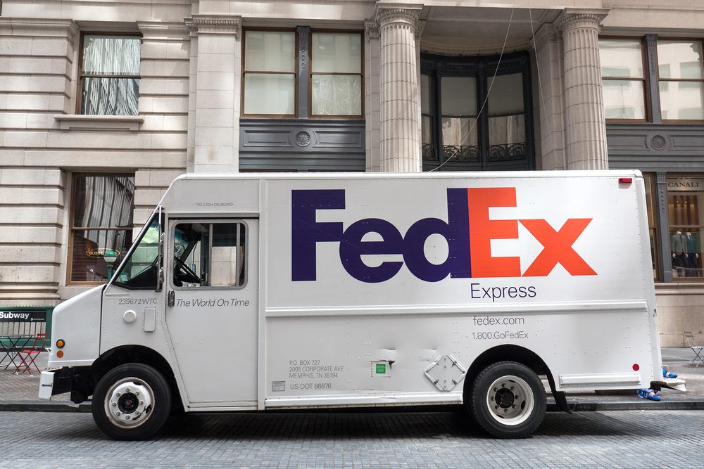
#1 FedEx
The delivery company’s logo is actually pretty normal looking when you look at it quickly, or if you don’t really look at it closely. The hidden message is actually easy to miss. If you look at the space between the “E” and the “x”, they make up an arrow pointing forward; it represents a speedy and accurate delivery. How often that happens is up to luck!
#2 Wikipedia
Ever since it started, Wikipedia has become a staple in our lives. Most of us will end up on Wikipedia because we need some quick information on a topic or because we are looking for a cohesive article to give us more facts or clear up a mess. However, for such an extensive library, a lot of us have wondered why the logo is supposedly incomplete.
The hidden message behind the company’s choice is that the puzzle made from pieces in various languages actually represents the “incomplete nature” that is part of the company’s mission! Its goal is to be the “go-to” information portal, built on submissions by users. This means that, since they’re user submissions, the site can never be completed! A very fitting and expressive logo.
#3 Tostitos
We all thought that the two colors added to the logo of this popular snack brand were just to make it easier to recognize! However, there’s a really creative and hidden message hidden in the name, along with the two pops of color!
If you look at it carefully, you will see that the two “T”s are actually people, and the body of the “i” makes up the table: the red circle is a bowl of salsa, and the yellow triangle is a chip! Together, they represent a family coming together to share the tasty snacks with a delicious bowl of salsa (or queso… or guac!).
#4 Pinterest
How many of you have lost a good few minutes going through your interests and looking at the colorful images, trying to find the perfect DIY or recipe amongst them? There’s just something that makes you forget the time when you are scrolling through Pinterest. However, their logo isn’t as cut and dry as it may seem: it’s not just a stylized “P” in the middle of a red circle.
The company actually designed the letter “P” to double as an illustration of a map pin! According to one of the designers of the logo, they didn’t want to physically include a map pin in it, so they tried to make it up. This way, the logo organically looks like both the letter and the item they wanted! Pretty ingenious!
#5 The Bronz Zoo
The old logo of the Bronx Zoo is actually really sweet: the two giraffes are absolutely adorable, and the birds around them actually give the impression of diversity. However, the hidden message of this logo is actually in the negative space made up by the space between the legs of the animal!
Yep, that’s the New York skyline! Can this logo be even more perfect than this?
#6 Tour de France
You wouldn’t expect us to include this one, right? To be honest, we didn’t realize the yellow circle in their logo didn’t actually represent the sun until we looked closer. Yes, we aren’t joking! The circle is actually one of the wheels of a bicycle!
The “R” in the word “tour” actually represents a person, and the “O” of the same word is the back wheel of said bicycle. Very on brand and a nicely packaged hidden message!
#7 Unilever
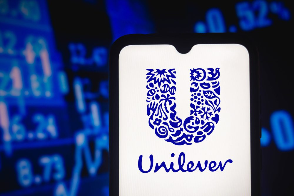
It’s virtually impossible to not have seen the Unilever logo before. After all, they represent and distribute so many of the brands we know and trust. One would think we would have paid more attention to their interesting design before! Yet, not many people can make out more of it other than the “U” shape it has and the fact that it’s very decorated.
Truly, with how small it is on some packages, you can’t really see anything else, but in reality, there is a slightly hidden message inside this logo as well! While it does stand for the initials of the huge company, the letter isn’t just nicely decorated, but actually made up of all the products that the brand offers!
They tried their best to represent everything the company covers with their myriad of other brands, and, as an umbrella for a lot of other companies, we think they did a great job. Every time you look at it, you can see something new!
#8 Adidas
This one seems to be more straightforward, right? With apparently no hidden messages in sight, the only significance that the lines could have would be to get your attention to the name of the brand: after all, it’s written in lowercase and just bold. Actually, those diagonal stripes aren’t without meaning: they’re supposed to represent a mountain.
Adidas wanted it to represent the mountains that elite athletes that wear their brand would strive to conquer, no matter the difficulty! We can’t really figure out what it could represent for everyday people though…
#9 LG
Look at the logo carefully. Can you see it? Their company’s name is so cleverly made to resemble a smiley face. We think it could be trying to convey the happy face of someone who buys LG products! Actually, it doesn’t mean anything of the sort. The smiley face? A lie.
People versed in logos will tell you that you have to tilt your head to the side and look at the logo again before you make any assumptions: it’s made in a such a way that the smiley face actually resembles a modified version of Pacman (anyone else loved that game all the way back?).
The speculation is that it might be an ode to the arcade game, their beloved character, and potentially to the simpler days when technology wasn’t so complicated. Yet, it might as well not be that at all. The official stance of LG is that their logo stands proudly for the world, the youth, the future, technology, and humanity!
#10 Wendy’s
You probably think that we are pulling your leg. Much like the fast-food restaurant when their social media intern ends up roasting people who ask for it on Twitter every once in a while. Yet, while Wendy’s logo is pretty straightforward, there is actually a hidden message in it. To be more exact, on the Wendy’s girl’s collar there is a secret word that is spelled out from the way her clothes are.
If you squint, you can see that the design spells out the word “Mom” on the collar of her blouse. A lot of culinary experts and logo makers have assumed that it was an ode to how the restaurant chain is trying to give their food a homey feeling. The funniest reveal ended up being not the hidden message in the logo, but rather that the people in charge at Wendy’s had no idea about the secret, and they said on record that it was totally unintentional.
#11 One of the best hidden messages: Hyundai
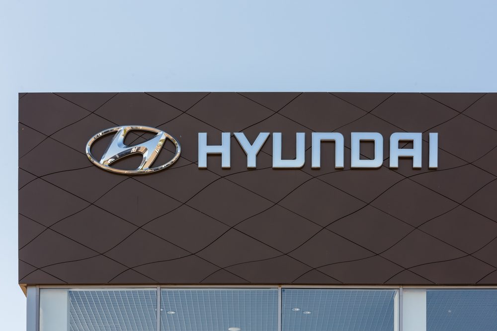
It’s a snazzy letter to represent the initials of the brand, no? It’s nicely stylized, and most have thought that it is slanted like that to showcase that the cars can reach high speeds. Nothing more straightforward…Yet, we would all be wrong.
While the logo does look like the letter “H”, it doesn’t stand for that. The South Korean brand logo actually depicts two people shaking hands: they stand for the satisfied customer and the salesperson! This is one hidden message we wouldn’t have figured out on our own.
#12 Beats By Dre
We all remember that time when everyone was obsessed with the idea of owning a pair of Beats by Dre headphones. And while we cannot deny that the sound quality is amazing, people were too crazed about them at one point in time. However, their logo might actually have a hidden meaning that has never even crossed your mind before.
It’s easy to spot, no? It’s a simple “B” in lowercase, to make the brand easily identifiable. Well, not really. It is a “B”, yet it doesn’t come from the name of the brand. The red circle is actually supposed to represent a human head, and the letter is actually a pair of headphones! The logo literally shows someone wearing their product. Pretty clever, if you ask us!
Read more about what makes our amazing country so unique!






1 thought on “12 Hidden Messages in Company Logos That Will BLOW Your Mind”
Read this with interest. I’d love to give the author a Rorschach Test. I’m sure the responses would be enlightening!